Data Tampering: GISS Caught Red-Handed Manipulating Data To Produce Arctic Climate History Revision
Changing the Arctic Climate
By Ed Caryl
GISS and the GHCN are preoccupied with the Arctic, bestowing large “corrections” on the few and far northern stations. The raw data of the Arctic did not tell the story they wanted to hear, and so GISS took it upon themselves to rewrite it.
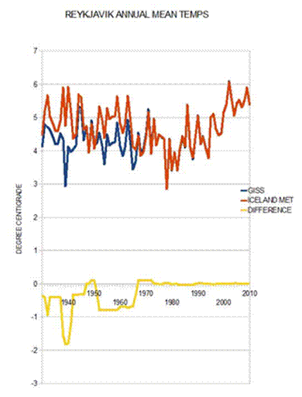
Let’s start with Figure 1 from Paul Homewood’s article How GISS has totally Corrupted Reykjavik’s Temperature, used by permission.
Last year in May, GHCN did a major revision of their historical temperature database. They changed the title of the database to GHCN-M version 3. GISS followed. They refer to the new data as GHCN_v3. The important thing to note is that GHCN_v3 already contains homogeneity “corrections” so there is in most cases now, no difference between
GISS “raw” data (after removing suspicious records), and “after GISS homogeneity adjustments.” As a result, we only get to see temperature data that has already been modified by the hand of man (or a computer under the direction of a man).
What has this done to temperatures? You get one guess.
What did they do in the Arctic? Above the Arctic Circle, there are few weather stations.


At Ostrov Kotel they simply warmed the whole series from just before 1950 to 1995 With obvious steps at each end of the change. At Barrow, (Figure 6) the change was a series of ramps. This makes little sense at Barrow. For all its history the measuring site has been at the airport. Barrow has a well-documented heat island, but the correction is in the wrong direction for that. Again, the correction takes away most of the 1960’s, 70’s, and 80’s cooling.
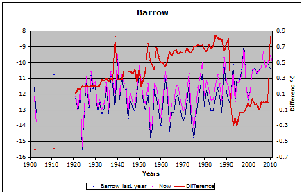
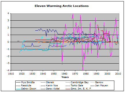
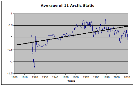
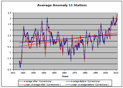
Figure 9 below shows the average anomaly for those 11 stations:
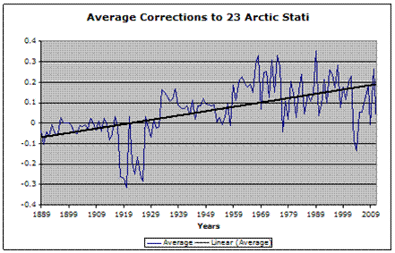
I had data from a dozen other Arctic and Northern Siberian stations from last year. Most of those had just a few minor changes. Here (Figure 10) is the average correction for all 23 stations. As one gets further from the extreme Arctic, the changes begin to average out. If all stations around the globe are included, the average becomes that slow warming “correction” seen in Figure 2.
By Ed Caryl
GISS and the GHCN are preoccupied with the Arctic, bestowing large “corrections” on the few and far northern stations. The raw data of the Arctic did not tell the story they wanted to hear, and so GISS took it upon themselves to rewrite it.
Let’s start with Figure 1 from Paul Homewood’s article How GISS has totally Corrupted Reykjavik’s Temperature, used by permission.

Figure 1: Corrupted Reykjavik’s temperature
In January of this year, Paul Homewood of Not A Lot of People Know That, wrote an article describing GHCN and GISS changes to the temperature data that resulted in early 20th century cooling in Reykjavik, Iceland. Because I had stored many annual temperature records for Arctic stations in preparing A Light In Siberia in September of 2010, this prompted an investigation into whether GHCN and GISS had pulled the same on other station data. The short answer…yes they had!Last year in May, GHCN did a major revision of their historical temperature database. They changed the title of the database to GHCN-M version 3. GISS followed. They refer to the new data as GHCN_v3. The important thing to note is that GHCN_v3 already contains homogeneity “corrections” so there is in most cases now, no difference between
GISS “raw” data (after removing suspicious records), and “after GISS homogeneity adjustments.” As a result, we only get to see temperature data that has already been modified by the hand of man (or a computer under the direction of a man).
What has this done to temperatures? You get one guess.

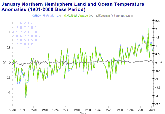
Figure 2. This is a GHCN comparison of database version 2 and version 3. Land and Ocean Temperatures for January. Source: NOAA/GHCN here.
The chart is subtle in that the scale is chosen to hide the slope and amount of the change trend. But look closely. Note that the change trend is from cooler in the past to warmer in the present, even though the temperature trend is already in that direction. They just added another ~0.1°C to the century trend.What did they do in the Arctic? Above the Arctic Circle, there are few weather stations.

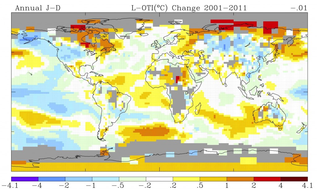
Figure 3. This is the last ten years temperature trend. From GISS.
The red Arctic grids on the anomaly maps represent ten stations, most in Arctic Russia. It is a bit difficult to sort out specifically which stations these are. Eleven stations in or close to these locations were investigated. Many have quite large “corrections.” Ostrov Dixon is the red grid square on the left on the north coast of Russia. Barrow is the orange grid square at the top of Alaska. Figure 4 is the first example.
Figure 4. This is the temperature change and change amounts to the Ostrov Dixon (Dickson Island) station.
The mainstream climate scientists have always disliked the warming in the 1920’s, 30’s, and 40’s, and the cooling in the 1960’s and 70’s. At several locations in the Arctic they have sought to “correct” these years.
Figure 5. Ostrov Kotel (Kettle Island)

Figure 6. This is the temperature change at Barrow.
At most locations they were not so obvious. For 11 locations that seem to be the heart of the warm grids, here are the plots.
Figure 7. The GHCN/GISS corrections at 11 Arctic locations.
It is very difficult to see a pattern in Figure 7. Some stations have a wild pattern of corrections of several degrees. Some have just a few spikes here and there. Some have a definite pattern.
Figure 8. This is the average “correction” of all the stations in Figure 7 with a linear trend line.
Figure 8 shows the pattern: cooling of the distant past, and warming of the inconvenient 60’s and 70’s.Figure 9 below shows the average anomaly for those 11 stations:

Figure 9. This is the average anomaly for the 11 stations before and after GHCN “corrections”, with trend lines.
In Figure 9, the “corrections” have doubled the warming trend from 0.7°C per century to 1.4°C per century. The pesky warming in the 20’s and 30’s, and the cooling of the 60’s and 70’s are now nearly on the same level, almost wiping out that inconvenient AMO cycle.I had data from a dozen other Arctic and Northern Siberian stations from last year. Most of those had just a few minor changes. Here (Figure 10) is the average correction for all 23 stations. As one gets further from the extreme Arctic, the changes begin to average out. If all stations around the globe are included, the average becomes that slow warming “correction” seen in Figure 2.

Figure 10. This is the average of 23 Arctic stations.
GHCN seems preoccupied with the Arctic, bestowing large “corrections” on the few far northern stations. This is in line with the “climate scientists” belief system:- The Arctic is warming faster than the rest of the globe.
- Ocean cycles have little effect on the climate.
- The present decade is the warmest.
- CO2 rules.
No comments:
Post a Comment